Run

Run

Thursday 23 July 2015

The Making of: Goofy (Kingdom Hearts: Chain of Memories)

Finally got new pegboards! The old ones are in bad condition due all the ironing. Nowadays I only use the masking tape method when ironing =)

I bought Nabbi's/Photo Pearls' pegboards this time. They were only 1€/pegboard when you ordered at least twelve. Not bad price compared to Hama's boards which usually are at least 2€/board. There is some difference in the boards. Hama's pegs are longer for example and Nabbi's have 30 pegs instead of 29. Hama's boards clearly fit tighter together. I'm not sure Nabbi's would hold together if you tried to lift them. On table they hold together well and that's the main point anyway. The new pegboards are also see through. Previously I have only used white pegboards. Let's see how the new ones work out:

As the first project I chose Goofy from Kingdom Hearts: Chain of Memories. Here's the first phase. As usual I started with the easiest colours. Blacks and grays this time. The lightest gray was little bit blueish in the original sprite, but since I don't have that kind of colour I used Hama's light grey. Colours:
Photo Pearls: Black
Hama: Gray (17), Light gray (70) and Dark gray (71).


Still easy colours. (Also added black to the nose. Missed that the first time around.) And as you can see my table is kind of short so I will add the last pegboard and Goofy's leg in the end. =)
Photo Pearls: Red (19), Dark green (9), Light green (22) and White.
Hama: Pastel green (47).


Getting to the harder colours. This one was a debate between Hama's Light brown (21), Photo Pearls Light brown (20) and Brown (27). I rejected Photo Pearls' Light brown because was too light and Photo Pearls' Brown because I feared that it would be too close to which ever dark brown I would use.


The dark brown, which looks almost black in this photo even though I edited it lighter, is Photo Pearls no. 3 Chestnut.


The hardest choices were the brownish orange, the light yellow and the king of brownish light yellow. Below are bunch of combos I tried out for them. In the cap there is Photo Pearls' Orange (13) and Yellow (21). In Goofy's lower jar there is Hama's Creme (02) and Teddybear brown (60) and Photo Pearls' Orange (13). On the upper part of the face there is Hama's Creme (02), Photo Pearls' Yellow (21) (supposed to be the same colour as Hama's Teddybear on jaw) and Photo Pearls' Rust (05) (this one is orange in the cap and jaw). I also changed Hama's Light brown to Photo Pearls' Brown (27) because Rust and Hama's Light brown were almost the same. Final colours in the next pic.


I chose Photo Pearls' Orange as the orange, Photo Pearls' Yellow (21) as the brownish light yellow and Photo Pearls' Light beige (12) as the lightest yellow. Hama's Creme was just too yellow for the face and too close to the Photo Pearls' Yellow. The whole face was just too yellow. I thought really long about using Hama's Teddybear brown instead of Photo Pearls' Yellow but it was just so dark, compared to the colour in the sprite, that I decided against it. Now only thing left was the leg and ironing.


Below the whole work half way through the masking tape.


And final product on the wall with Sora and Neoshadow. The face is little bit too yellow for my liking, but other ways it looks good.


Sprite from spriters-resource.com as usual.

Tuesday 14 July 2015

Super Metroid: Samus

This time I made Samus from Super Metroid which is another all time favourite game of mine from SNES. I made it facing sideways so that, if I want to create monsters or a level from Metroid, Samus is already ready for action. Maybe Mother Brain next =)


Choosing what colours to use was little problematic as usual, but I think that in the end the colours worked out pretty well and the ironing (for once!) worked out too.
Colours used:
Hama: creme (02), yellow (03), red (05), green (10), black (18), dark red (22), dark green (28), burgundy (30), neon orange (38) and pastel green (47).
Photo Pearls: dark green (09) and green (16).

Sprite for Samus from spriters-resource.com as usual:

Saturday 11 July 2015

Kingdom Hearts: Sora

Sora is one of my biggest creations so far.


It was also one of the first where I used both Photo Pearls and Hama. I didn't iron it quite long enough and when I flipped it to iron the other side some Photo Pearls were still lose and flew all over the place. Luckily I could still get them back to their places. I also apparently didn't iron the keyblade enough, but that I noticed only after I had ironed it from the other side as well. You can see that one of the dark grey beads is out of its proper place. After this one I have all ways used the masking tape method. =D (Here's a youtube video if you want to know more about masking tape method.)

I used AbyssWolf's Sora as a model for this. Original art can be found in Deviantart (partially concealed by other characters) and in here (not quite sure what this is about because the site is in Spanish). Sora is number 70 behind the other link.

I did some recolouring because I wanted Sora look more like the original in Kingdom Hearts II. I also modified the keyblade and Sora's legs a bit.

All in all I'm quite satisfied with Sora.

Tuesday 7 July 2015

Characters from Chrono Trigger and The Legend of Zelda: A Link to the Past

Link from The Legend of Zelda
The beads are all Hama except blues on the shield and on the sword, yellow(ish) on Link's tunic, browns on Link's hands/arms and orange on the hat and on the foot.


Chrono, Robo, Lucca, Marle and Ayla from Chrono Trigger (that most awesome rpg from SNES!)
Chrono

Orange, blue, light blue (on the clothes not on the sword), that greyish brown (on legs, 5 beads together), and the lighter skin colour are Photo Pearls. The rest of the beads are Hama.

Robo

The greens on the eyes, the three shades of grey, black and gold are Hama, rest Photo Pearls. This is the first time I used Hama's gold. I was a bit worried how the gold beads would turn out because after ironing they tend to become sort of two-coloured, but luckily that happened only on lower part of Robo and you can only see that if you look closely.

Lucca

Orange, white and greens are Photo Pearls; pink is Pyssla and the rest are Hama. I did some experimenting and ironed this one longer. I was hoping that the PP (Photo Pearls, don't feel like writing the whole name anymore) would melt a bit more from the back side. Well they did melt a bit more, but so did the Hama beads. Lucca got so thin and soft that she got warped from the middle. You can see that the vertical lines are not straight. It doesn't look too bad from the distance, but I'll probably try to straighten it.

Marle

Orange, white, light beige (on the hands for example, looks almost exactly as white) and the darkest green PP, rest Hama. With this one I tried lower temperature with longer melting time, hoping that the beads would melt more evenly. No luck. As you can see, the Hama (grey ones especially) are much more melted than the PP. Marle also warped a bit, but not too much.

Ayla

Black, white and brown are PP, the rest are Hama. You can recognise the brown PP by their not-melted-as-much-as-Hama form =) Another experiment: PP black on the edge and more pressure when ironing. I was hoping that the PP on the edge would prevent the warping and that the greater pressure would melt PP more. Result: Failure. PP didn't melt anymore than normally and I think that the black PP on the edge created some warping on their own. Just look at Ayla's right leg (left leg from our point of view). The bottom left corner has clearly bended downwards. Not too badly luckily and you can't really see it from distance. So what did we learn today? No use to try to melt the Photo Pearls as much as the Hama beads melt. You get better looking beadsprites by not doing so. Just look Link, Chrono and Robo.

And here are all the characters on the wall

Sprites for the characters are from spriters-resource.com.

Sunday 5 July 2015

The Making of: Mario with the cape (Super Mario World)

Here is some of the work and thought process I went through when making Mario from Super Mario World (which is one of my all-time favourite Mario games). The sprite below is from spriters-resource.com.
Sorry for blurry image by the way. I tried about half an hour to get it sharper, but it just wouldn't co-operate. It is perfectly sharp on my computer, but something on Blogger blurs it. Maybe it got something to do with the fact that the image is so small (original size here:). If someone knows how to make it sharp I'm all ears =) The colours are the most important thing for this post anyway even though the form is a little bit difficult to see.

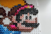
Back to business then. This Mario is pretty simple, about one pegboard in size. Only the colouring of the face produced some difficulty. Because I could see that from the beginning I decided to start from the easy colours and proceed to harder from there. So first the black:


Next yellow and white, no problems there. Yellow is Hama yellow (product number 03). Black is Hama black and white is the white of Photo Pearls, if you are interested. Reason for different brand of white and black was that I had run out of Hama white.


On the edge of the cape I used Hama burgundy (no. 30). First I thought about using dark brown (Hama or Photo Pearls), but I thought there was a reddish tint on the edge so I used burgundy instead. It is quite dark anyhow and I think it worked out pretty well.


Next Hama blue (no. 08) for Mario's clothes and that short section of the cape (which I found out a bit weird but it was on all the sprites I could find so I guess it is correct). In the cap there is two Photo Pearls (from now on just PP) yellows (no. 21) and one Hama teddybear brown (no. 60). The red in the cap and close to Mario's hand is Hama claret (no. 29).


I didn't quite have the right light brown, but the PP brown (no. 27) was the closest so I used that. I thought about using Hama light brown (no. 21), but it was too light and a bit too much like fudge.


Add some blues (PP no. 23 and 28). First I put Hama azur blue (no. 49) as the lightest blue, but it wasn't quite distinct enough so I changed it for PP.


Rare use for Pyssla beads. Pyssla pink to the cap and to the arm.


For the face I tried different combos. The light, almost white, colour is PP light grey (no. 10). It settled there easily, but the red/pinkish colour was harder.

This one is Hama pastel red (no. 44) which was actually close to the original colour, but was just a little bit too red. With it Mario looked like he'd done too much drinking... So I discarded it.


Here we have PP antique pink (no. 18). It looked most natural, but not like the original. Plus it didn't really fit in the cape.


My final choice was Hama pink (no. 06). It is not exactly the right colour either, but I think it was the best choice.


Here's the final work before ironing...


...and here after ironing. Diving on some Final Fantasy characters.


So what do you think? Did I make right choices or wrong choices? Comments appreciated.

Friday 3 July 2015

All these different colours!

I began this hobby with just ten differen colour. The ones that come in Ikea's Pyssla box.

Not much to go on, eh?

Soon after I bought all available colours from local arts and crafts store. That was about ten colours more. Their brand was Hama and now I had about twenty different colours. A mix of Pyssla and Hama. Twenty sounds plenty, right? At first I thought so, but after a while I knew that it wasn't nearly enough. I had all the basic colours. I even had two different shades of some colours. But at some departments I was lacking. For example I had only one shade of red. What if some sprite needed red and dark red? Just use red for both? Well, in addition to red I had also pink, but you really can't use that as a substitute for red.

Clearly it was time to do some acquisitions! Quick googling told me that there was two brands of beads that were more popular than the rest: Hama and Perler. Since Perler was mainly American brand and not easily available on Europe I decided to concentrate on Hama. I did some research on what colours would be sensible choices to buy, but in the end I ended up ordering pretty much every colour Hama has except the fluorescent, glitter and translucent. I used Hama's website for my purchase because it seemed most convenient. And cheapest.

Hama's colour palette

I did end up owning some translucent beads because I ordered some of those boxes that has almost every colour. With all the Hama's colours I was contend... for a while. I did some awesome (in my opinion at least =D) Super Mario Bros. sprites...


...and Chrono Trigger sprites.


I still wasn't happy with my colour selection. Especially Magus' face was unsuccessful and could have used more variety. Some of it's failure was due to my inexperience, I'm sure. I could have used colours more wisely, but anyhow I wanted more colours. I did some more googling and found Nabbi and Photo Pearls. Photo Pearls were quite easily available and the cost wasn't too bad either. Maybe I went a bit overboard, but I ordered all the colours they had. Except gray, yellow and purple which I judged were so close to the ones I already had that I wouldn't need them.


So here's my colour collection so far. Longing for some Perler colours though...