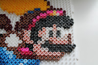
Here is some of the work and thought process I went through when making Mario from Super Mario World (which is one of my all-time favourite Mario games). The sprite below is from spriters-resource.com.
Sorry for blurry image by the way. I tried about half an hour to get it sharper, but it just wouldn't co-operate. It is perfectly sharp on my computer, but something on Blogger blurs it. Maybe it got something to do with the fact that the image is so small (original size here: ). If someone knows how to make it sharp I'm all ears =) The colours are the most important thing for this post anyway even though the form is a little bit difficult to see.
 ). If someone knows how to make it sharp I'm all ears =) The colours are the most important thing for this post anyway even though the form is a little bit difficult to see.
Back to business then. This Mario is pretty simple, about one pegboard in size. Only the colouring of the face produced some difficulty. Because I could see that from the beginning I decided to start from the easy colours and proceed to harder from there. So first the black:
Next yellow and white, no problems there. Yellow is Hama yellow (product number 03). Black is Hama black and white is the white of Photo Pearls, if you are interested. Reason for different brand of white and black was that I had run out of Hama white.
On the edge of the cape I used Hama burgundy (no. 30). First I thought about using dark brown (Hama or Photo Pearls), but I thought there was a reddish tint on the edge so I used burgundy instead. It is quite dark anyhow and I think it worked out pretty well.
Next Hama blue (no. 08) for Mario's clothes and that short section of the cape (which I found out a bit weird but it was on all the sprites I could find so I guess it is correct). In the cap there is two Photo Pearls (from now on just PP) yellows (no. 21) and one Hama teddybear brown (no. 60). The red in the cap and close to Mario's hand is Hama claret (no. 29).
I didn't quite have the right light brown, but the PP brown (no. 27) was the closest so I used that. I thought about using Hama light brown (no. 21), but it was too light and a bit too much like fudge.
Add some blues (PP no. 23 and 28). First I put Hama azur blue (no. 49) as the lightest blue, but it wasn't quite distinct enough so I changed it for PP.
Rare use for Pyssla beads. Pyssla pink to the cap and to the arm.
For the face I tried different combos. The light, almost white, colour is PP light grey (no. 10). It settled there easily, but the red/pinkish colour was harder.
This one is Hama pastel red (no. 44) which was actually close to the original colour, but was just a little bit too red. With it Mario looked like he'd done too much drinking... So I discarded it.
Here we have PP antique pink (no. 18). It looked most natural, but not like the original. Plus it didn't really fit in the cape.
My final choice was Hama pink (no. 06). It is not exactly the right colour either, but I think it was the best choice.
...and here after ironing. Diving on some Final Fantasy characters.
So what do you think? Did I make right choices or wrong choices? Comments appreciated.


No comments:
Post a Comment